Add Custom Hover Effect to Elementor Container: 4 Easy Steps
Hover effects help to break up long content and draw attention to key messaging. Here’s how to create custom hover effects in Elementor containers and columns.
To help you, I’ve included three sets of CSS and demos of how each responds.

4 Easy Steps to Creating Custom Hover Effects on Containers
Step 1: Open Your Page
To begin, you’ll want to open the page that you want to apply this styling to.
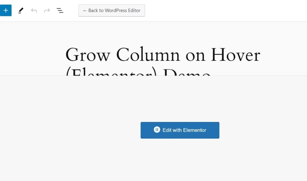
You can either 1) click Edit with Elementor in the page list or 2) click the large blue Edit with Elementor button while editing the page.

Step 2: Select Your Container
This feature will work for text blogs and images. The CSS is applied to the container as a whole. So whatever is inside the container will grow when hovered.
Step 3: Edit Container Settings
Now it’s time to add the hover effect settings.
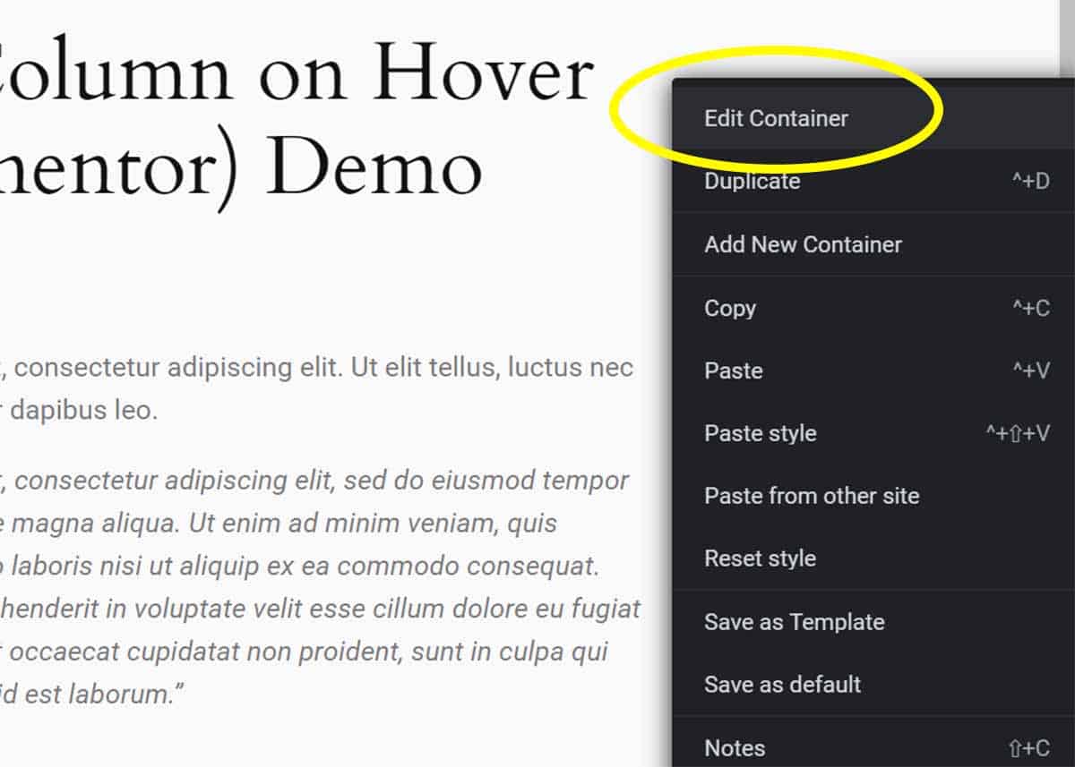
- Right-click on the container bounding box and click Edit Container.
- Optional: In the side panel, go to Styles > Background > Background Type. Choose Classic.
- Go to the Advanced tab (top right) of the widget.
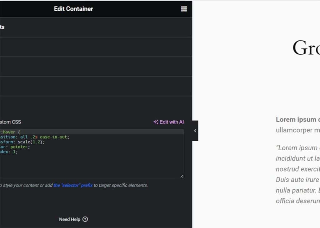
- Scroll to Custom CSS – all the way to the bottom.
- Enter your custom CSS code. I’ve included examples below.

This method is manual – without the use of another plugin. But don’t worry. It’s surprisingly easy to modify. And you can avoid adding the bloat of yet another plugin.
CSS Code to Create Hover Effect
Here are three sets of CSS to help you create this function on your site.
1. Base Hover Effect CSS
Here is the CSS code that I used to create a basic hover effect on my text widget. You’ll notice that it is surprisingly basic. And there are a number of modifiers that can be tweaked.
selector:hover {
    transition: all .2s ease-in-out;
    transform: scale(1.2);
    cursor: pointer;
    z-index: 1;
}
2nd Set of Code
Here is a variation of the first CSS code.
selector:hover {
transition: all .2s ease-in-out;
transform: scale(1.2);
cursor: pointer;
z-index: 1;
}
selector {
transition: transform .2s;
}
3rd Set of Code
You’ll notice that this CSS makes for the smoothest transition of all.
selector:hover {
transition: all .4s ease-in-out;
transform: scale(1.2);
cursor: pointer;
z-index: 1;
}
selector {
transition: 0.4s ease;
}
Here’s how each of these hover effects looks on text blocks. Each is marked to match the code above. Hopefully, yours looks similar to this.
More Elementor Skills: How to Create Color Gradient Text
Or check out our full set of WordPress tutorials.
Your Turn
How did it go for you? Were you able to successfully create custom hover effects on your Elementor containers and columns? If I missed something or you have a question, please comment below.

