Reverse Column Order in Elementor on Mobile: 3 Steps
Sometimes multi-column layouts can get scrambled on mobile devices. What looks good on desktop can get messed up on smaller screen sizes.
Here’s how to reverse column orders on Elementor. And fix layout problems on mobile devices for a better user experience.
How to Reverse Column Order in Elementor
This process is very simple. In Elementor, you can force specific breakpoints for phones and tablets.
Step 1: Open Your Page
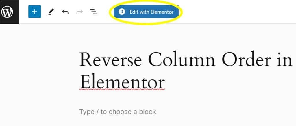
To begin, you’ll want to open the page that you want to customize.
You can either 1) click Edit with Elementor in the page list or 2) click the large blue Edit with Elementor button while editing the page.
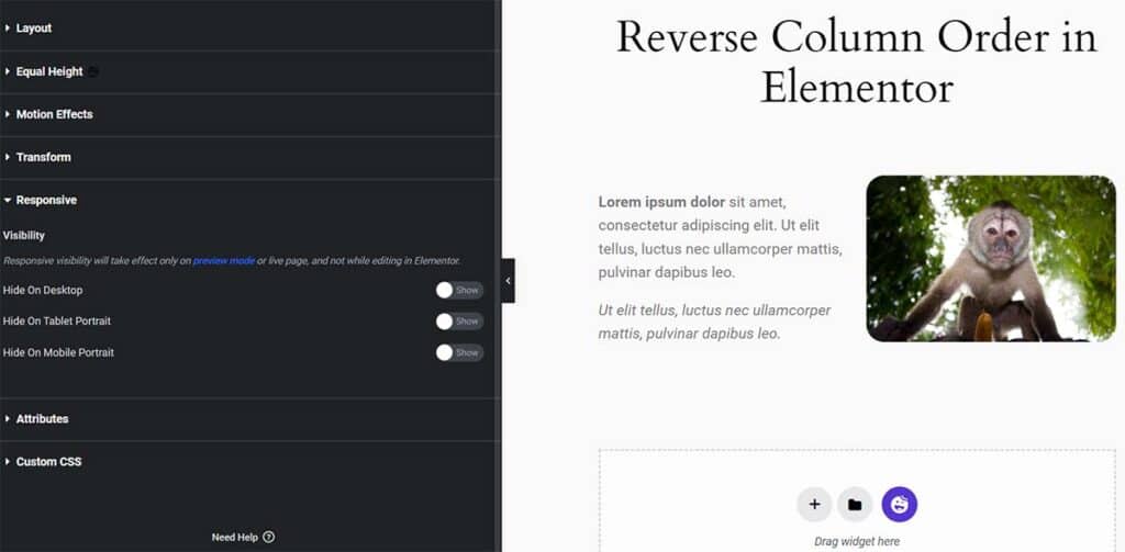
Step 2: Select the Section
Select the section that you want to adjust. It will display in the left menu.
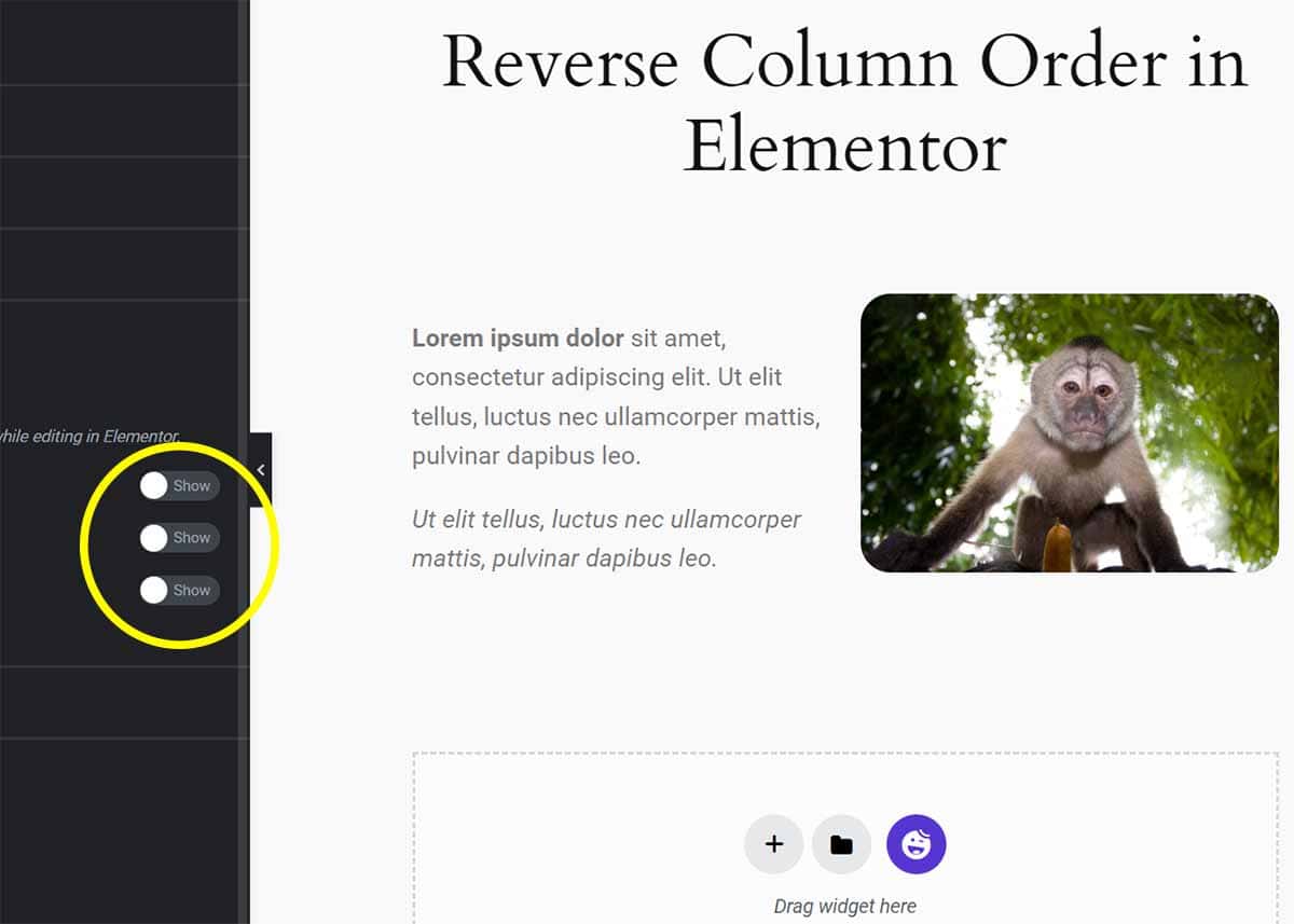
Step 3: Toggle the Reverse Columns Option
Go to Advanced > Responsive. There you can toggle the Reverse Columns option for mobile. This will automatically swap column order on smaller screen sizes.
Here’s a video tutorial showing how to do this.
Here’s how to set custom mobile breakpoints in Elementor. Keep learning in our large (and growing) WordPress tutorial section.
Your Turn
How did it go for you? Please share your questions and tips below!